Before
-
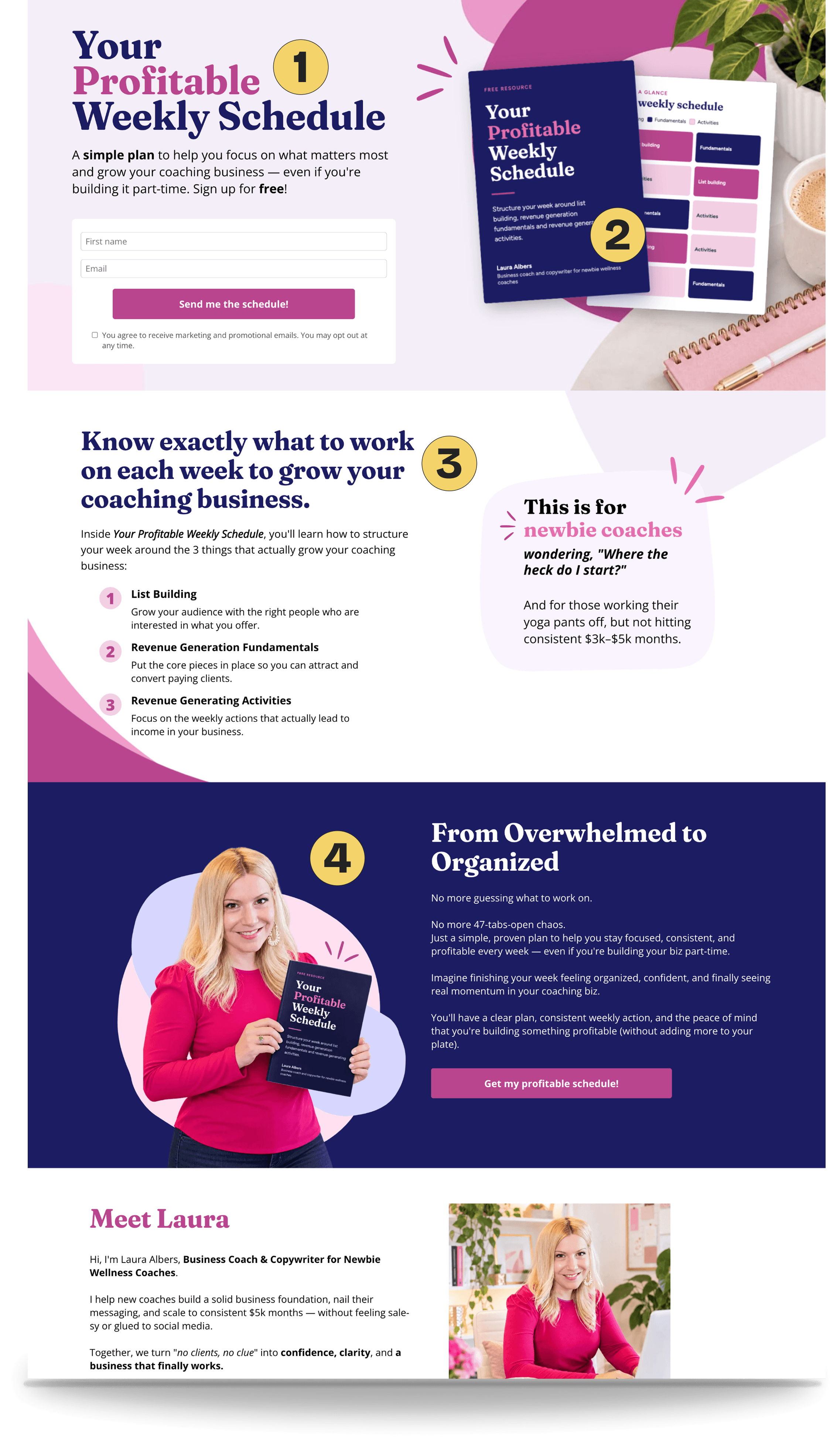
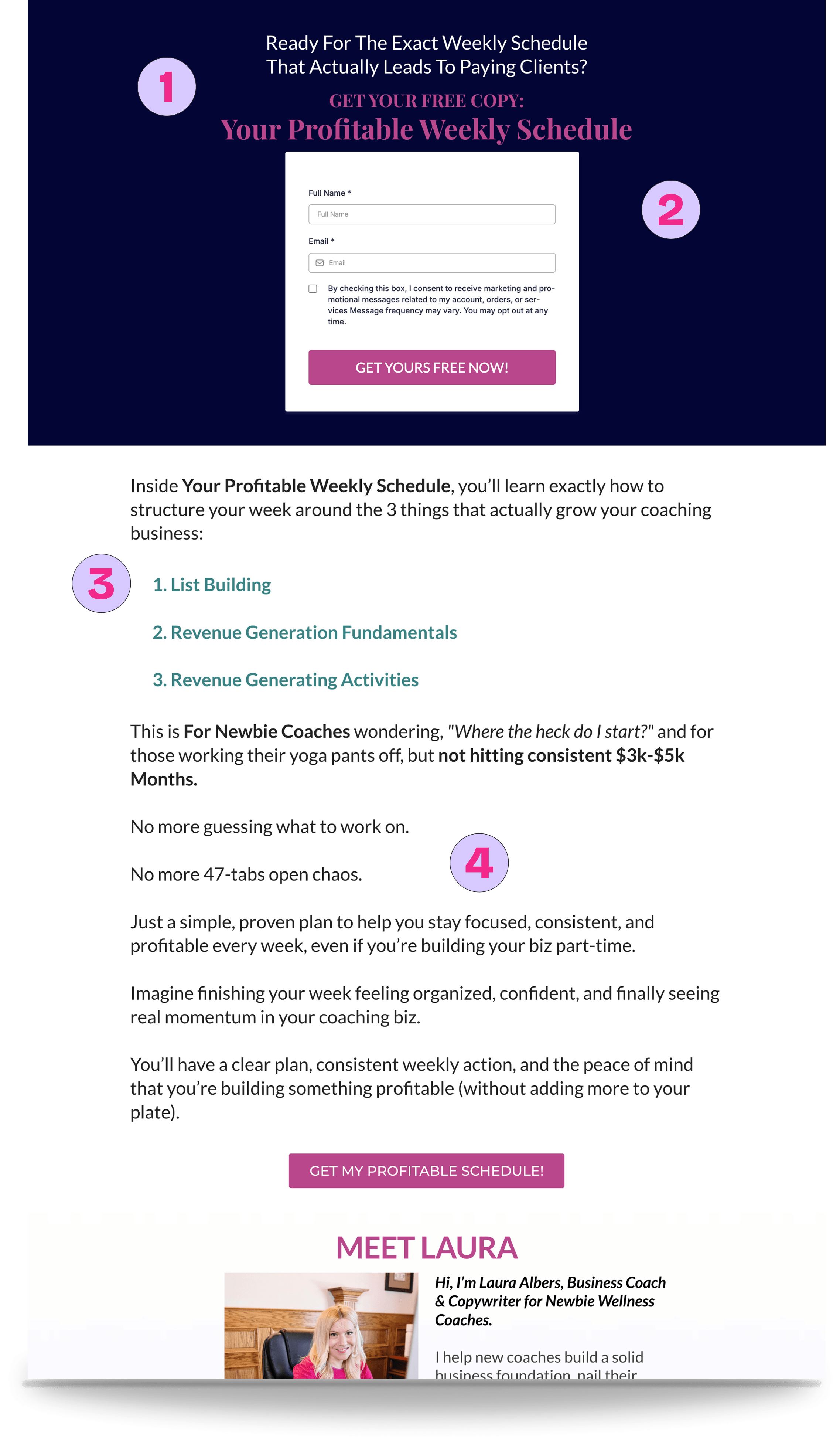
Hero aesthetic
- Heavy, dark background
- Low-contrast headline is difficult to read
-
Freebie preview
- No image of the free resource
- Visitors cannot see what they’ll receive
-
Content clarity
- Topic labels lack useful detail
- Audience message gets lost in the copy
-
Benefits presentation
- Benefits appear in a long block of text
- Important points are easy to skim past